
This post is going to describe a process to create a nautical chart. It will be done using Open Data, and QGIS 3.14 and is intended to be suitable for general interest audiences, as well as GIS Professionals.
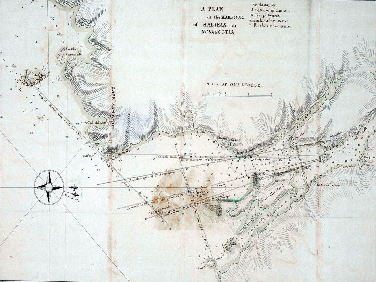
nautical chart production begins with a Survey. In times past, surveyors would go out in a small boat and take soundings with a lead line. those soundings would be located via triangulation to survey monuments located on land, themselves accurately positioned by use of a sextant. the problem with this method however is that lead lines can only tell you the depth of the single spot. multiple soundings will give you a good idea of the general depth, of an area, but can miss isolated rocks and other hazards. Modern Chart production begins with Multi-beam Sonar scan.
Bathemetry
Multibeam sonar results are then rendered into a GeoTiff. A geoTiff is basically an image file that is geographically referenced, and each pixel contains height (or in this case depth) data. in this case we will make use of the CHS Nonna-10 data set. This data set is “non-navigational”, in that it is not considered reliable enough to use for navigation, but is suitable for our exercise.

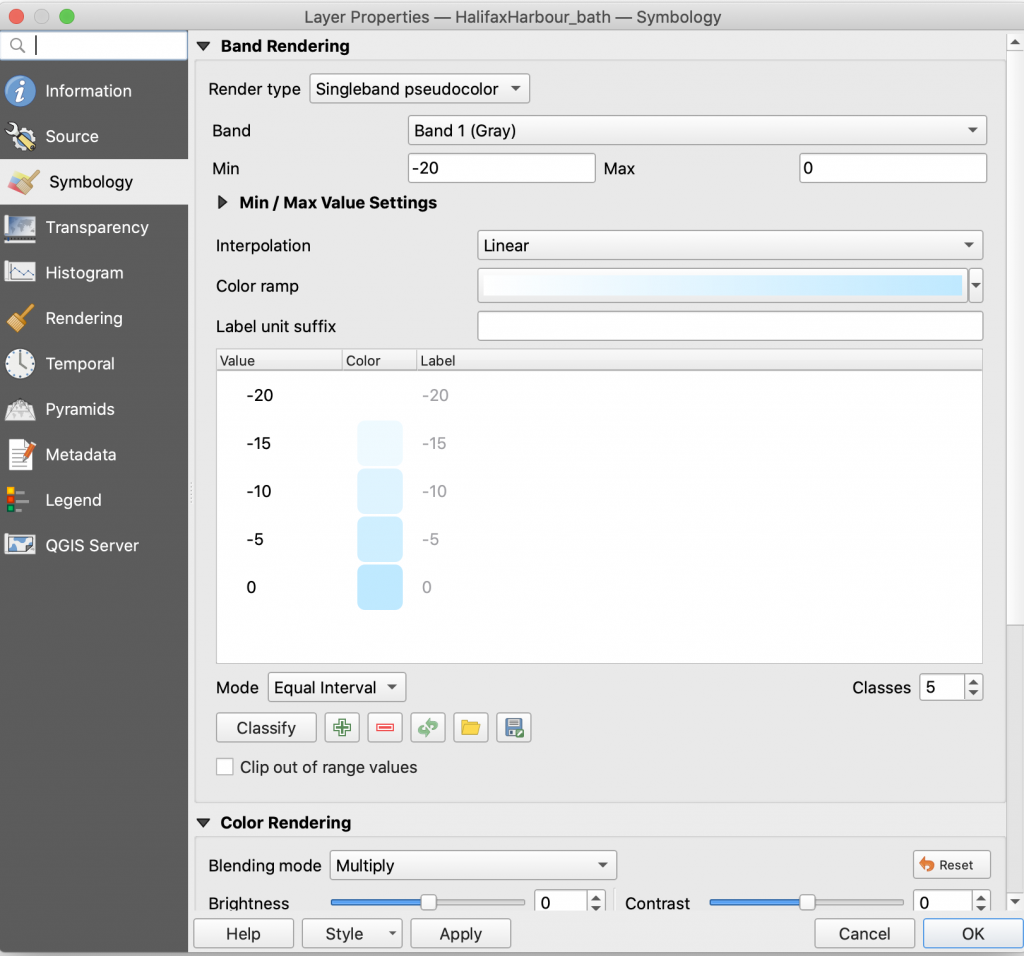
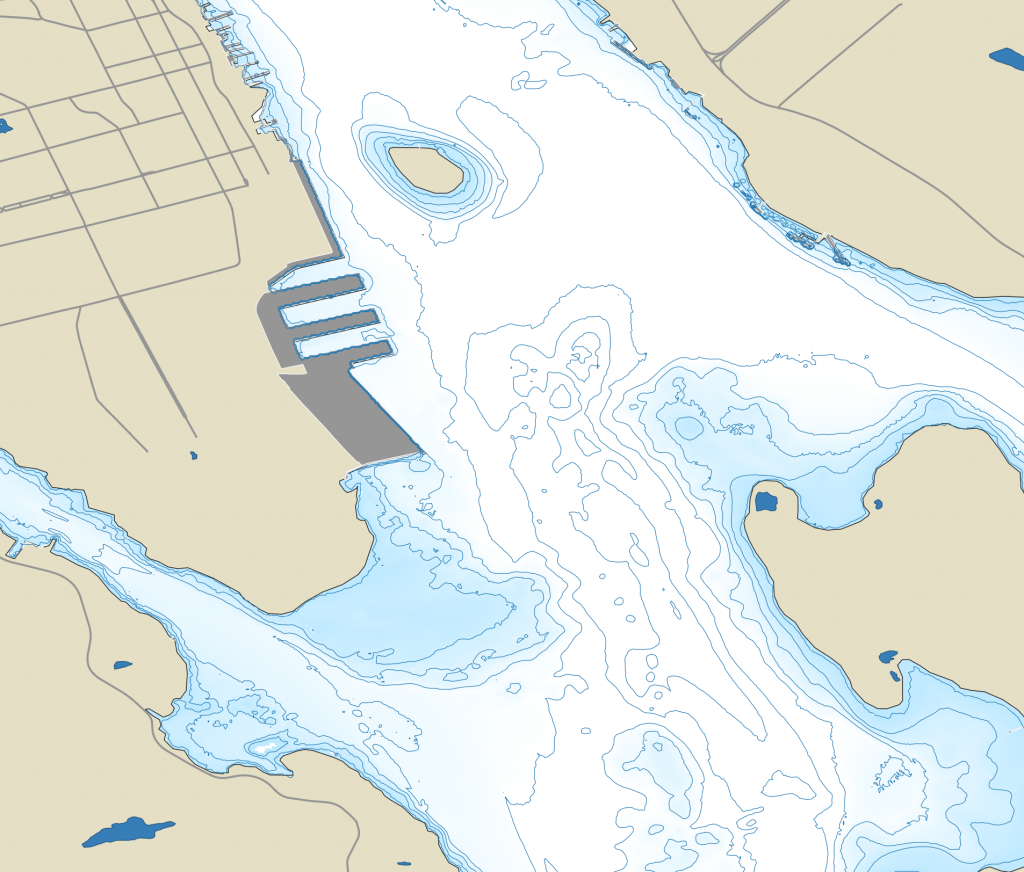
NONNA-10 data comes in individual tiles. once the tiles are loaded, we can perform a raster merge function to join them into a single file. Then change the render type to Singleband Pseudocolor, and apply a suitable color ramp. I chose a ramp that would give a blue highlight around the coast line, and white for waters 20m and deeper.
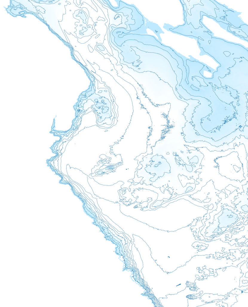
Next I Ran a Raster Extraction Contour, and set the Interval between contour lines to 5.00, to generate 5m contour lines.
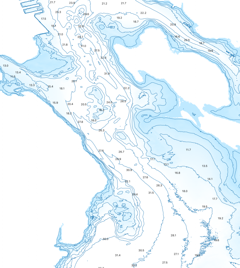
to get spot depths, i created a new point shape file, creating a bunch of points. those points then get used in the Sample raster values tool, which pulled the depth value from the raster file and generated a new point layer. We set the transparency of the points on that layer to 0, making them invisible, and then applied a labels with the depth. Our Values came back with a – sign in front, so we used the equasion editor for the source set to replace(rvalue_1, ‘-‘,”)
Land Features
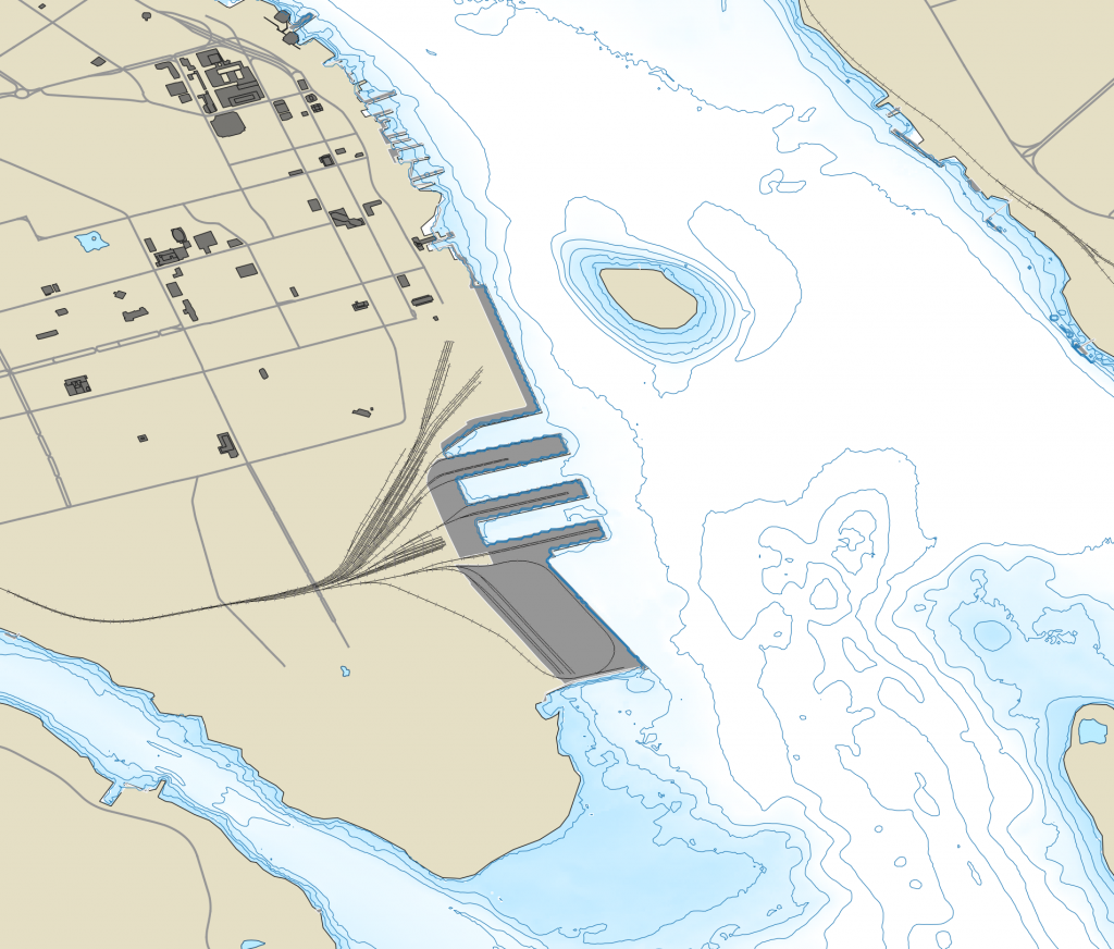
Terrestrial Features were derived from the StatsCan boundary files and the Marine facilities and inland lakes from the Nova Scotia Topographic Database – Water Features Shapefile. Halifax open data has a street centerline layers that can be used to populate terrestrial areas. the center lines were adjusted so only the major streets were symbolized, all with a dark grey symbology.
the open data portal also includes a building outline layer and buildings over 6 stories were symbolized. unfortunately a number of buildings lack floor data, so significant ones will need to be edited to add values so they display – theses are mostly features such as the grain elevator, Emera Building, and various transit sheds at the port.
the National Rail Network was also used to all railway tracks.
Nautical Features
Nautical features are generated from a number of sources.
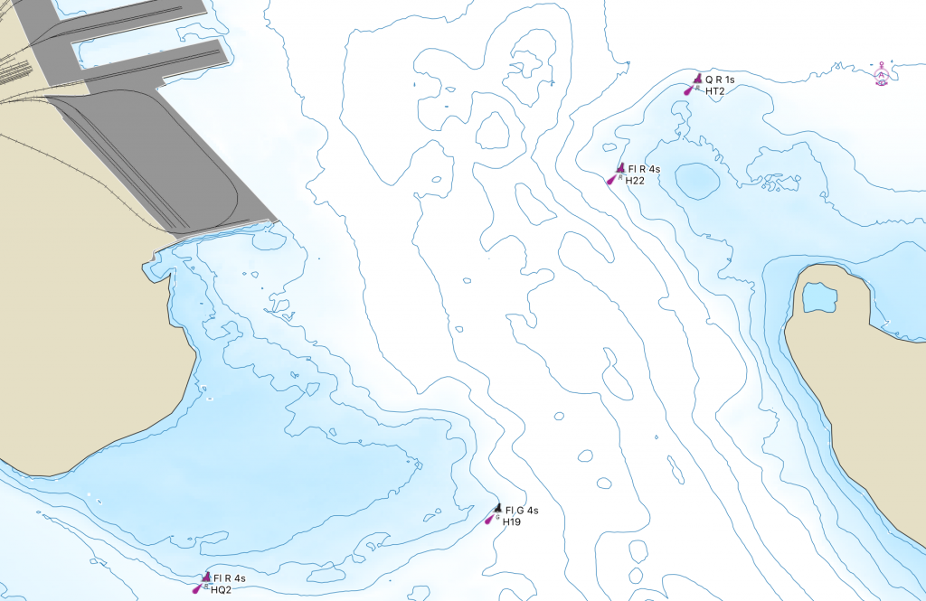
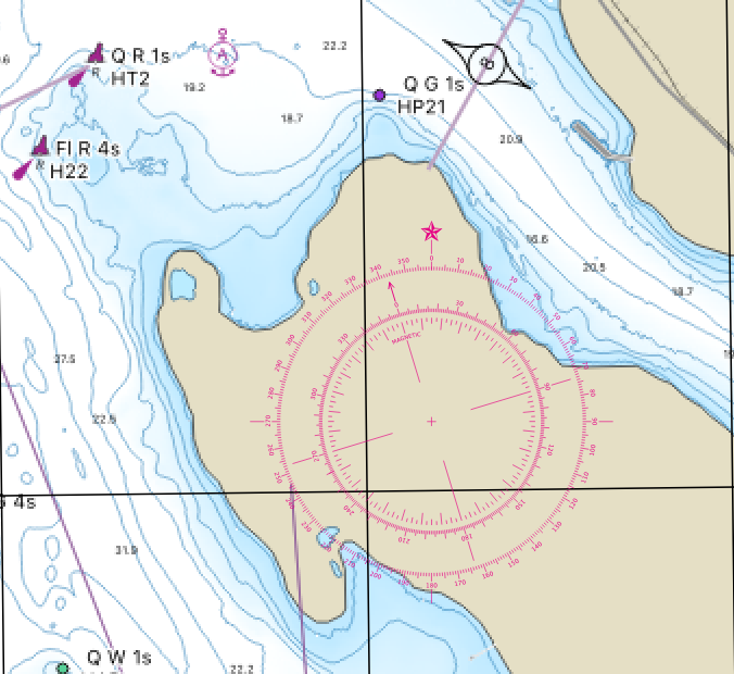
The list of Lights Buoys and Fog signals was converted into a point shape file, and then each type of buoy symbolized used the appropriate symbol from chart #1. The table includes the features name, code, position, characteristics and type.
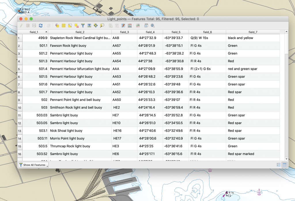
the symbols are literally svg files taken form chart#1, and and then the individual buoy expanded. The Symbols are assigned based on the values in Field 7, and the features labeled with the light characteristics (field_6) and code (Field_3)
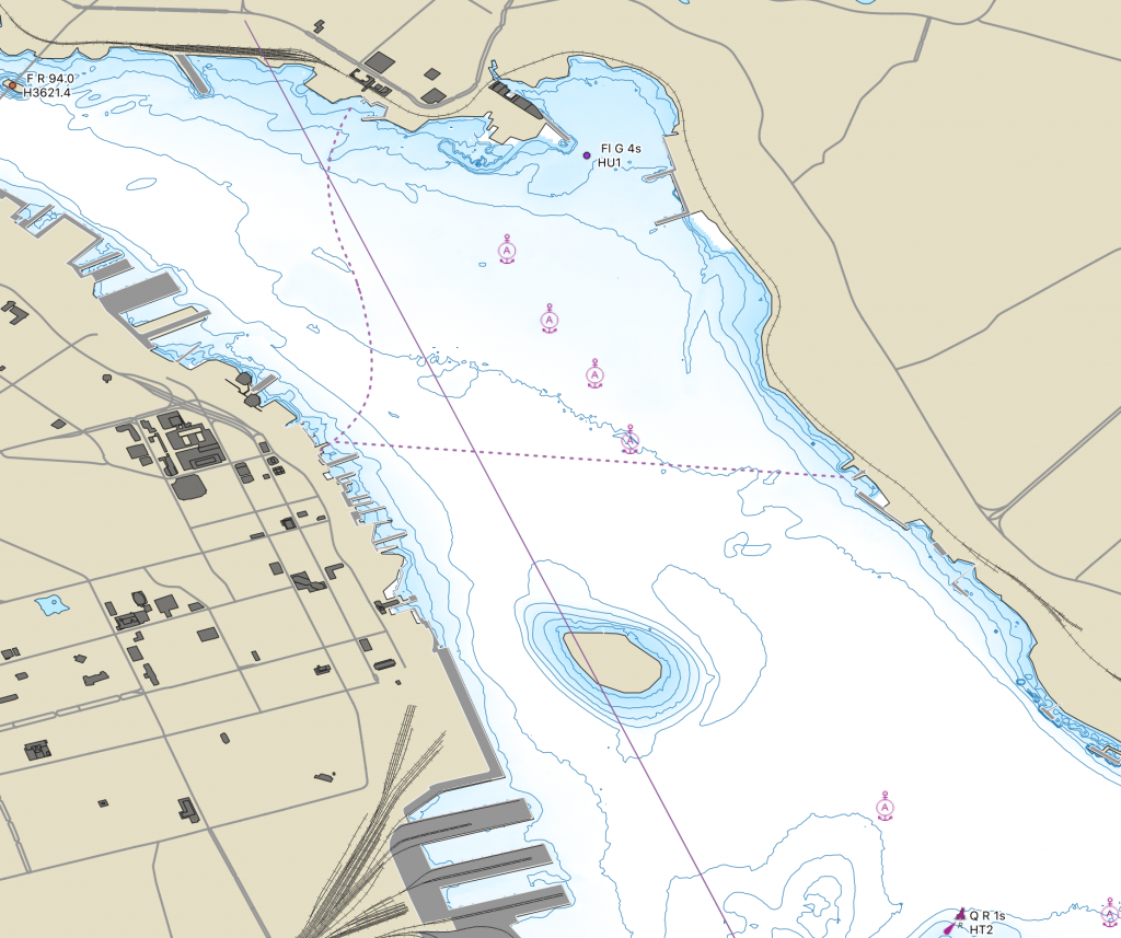
The anchorage data was provided by an open data set of Canadian anchorages. The inner anchorages are symbolized as above, and the outer Anchorage area was defined as a hollow polygon with a dashed line. The warning data was contained in the data set.
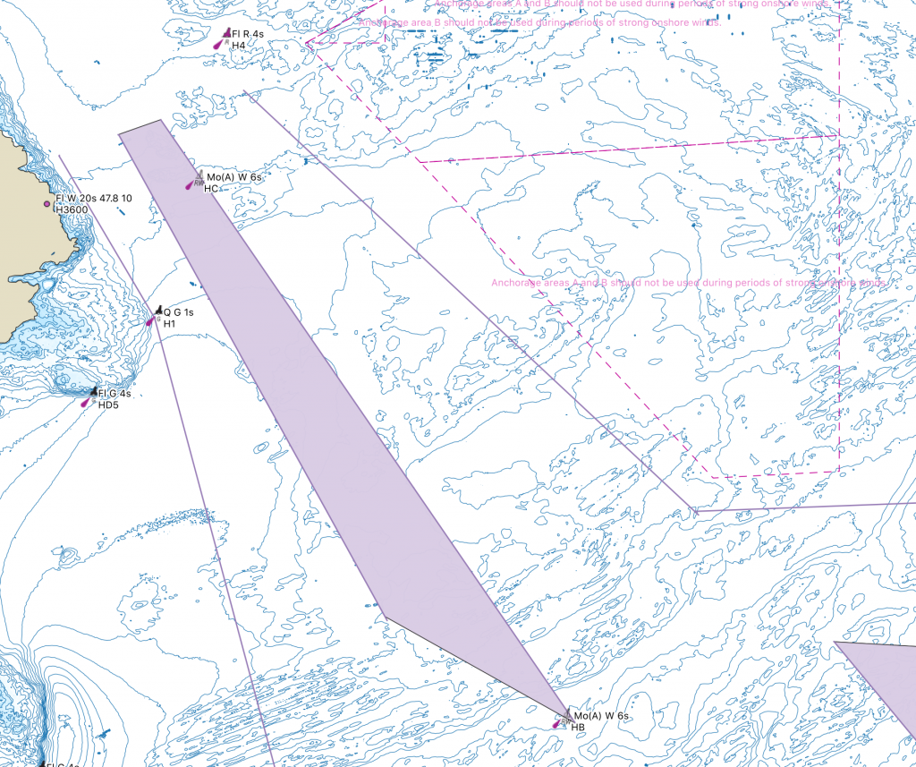
The traffic separation Scheme came from open data Vessel Traffic Routes. The traffic lanes in the outer approaches were edited to conform with CHS Charting practice, and to improve Appearance. The scheme also included data for Ranges, and the ferry track which were cleaned up and simplified.
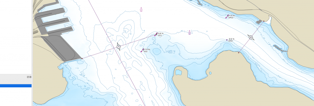
VTS Call in points were generated by creating a csv file of all the points taken from VTS Zone Regulations which define the Call in Points, then running the Points to path tool to connect them.
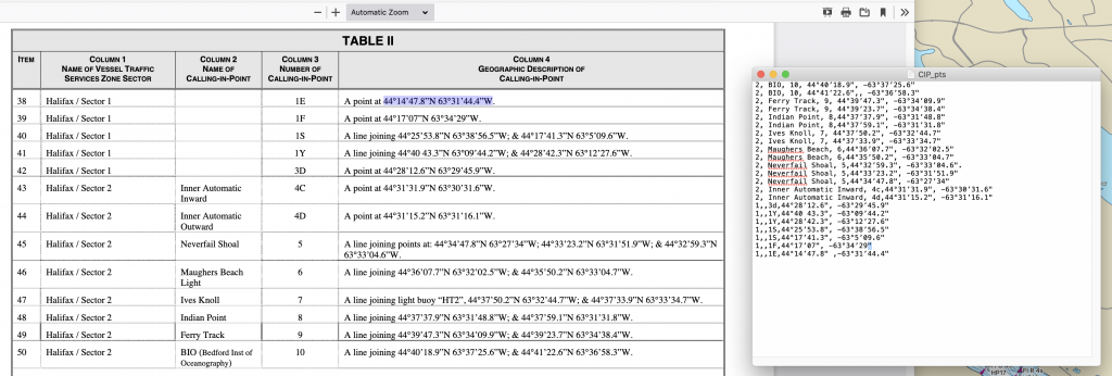
The Call in Points were then symbolized with a line, and the a label applied, using the SVG Callin point symbol as a background for the Label. Placement was arranged to centre the point number in the centre, and have the symbol span the line.
Producing the Chart
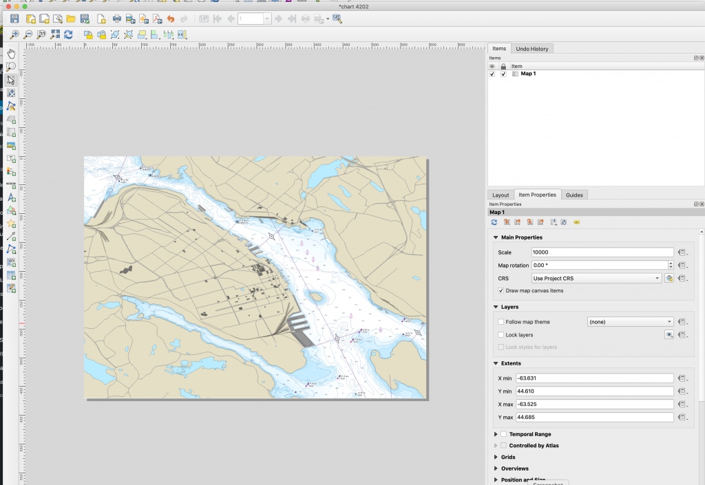
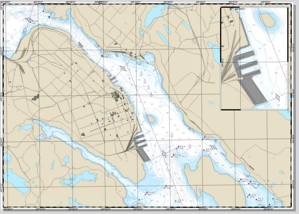
With all the elements digitized, its time to produce the actual chart. In this case we will produce Chart 4202 – Halifax Harbour Point Pleasant to Bedford Basin.
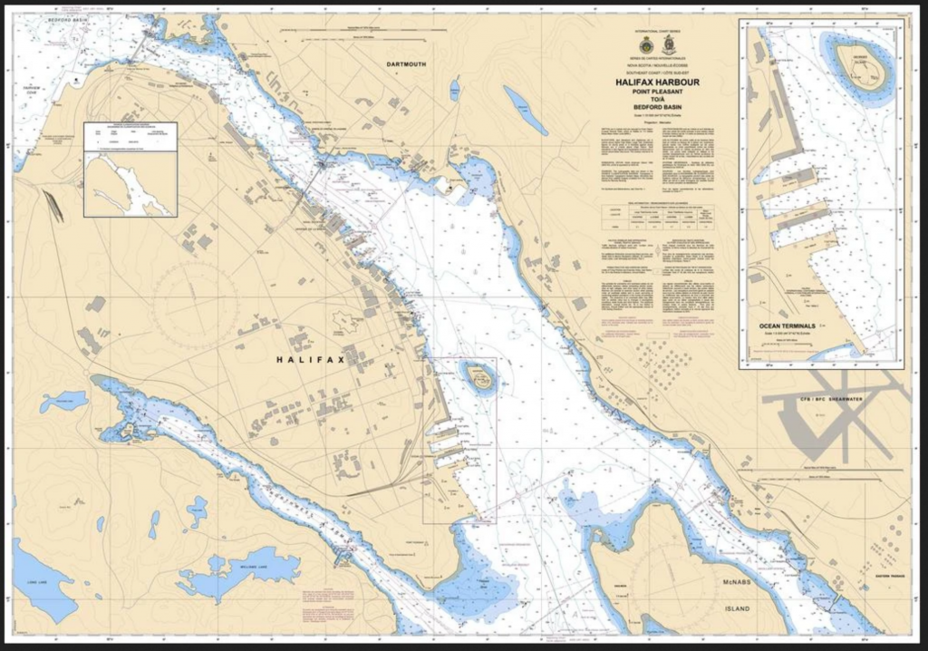
to Produce the chart, we create a new print layout, i called mine Chart 4202. i edited the page size to be Arch E paper, which is 36×48. add the map box, and the chart will render. Nautical charts are typically 1:10000 scale, so i set the scale to 10000, then adjusted placement so that the inner harbour is covered.
Then we need to change the projection to Mercator. to do so we adjusted the CRS to NAD83 CSRSv6 MTM zone 6
to get the border we want, we add two grids. the first is the standard 1minute interval using a value of 0.016660. we offset by X =20 and y=3 to get the grid to line up to even numbers. The second grid is a frame only, with the X and Y interval set to 0.001666666667 to give us 10ths of a minute. Both grids were done with the Zebra Nautical style. both grids use the WGS84 CRS.
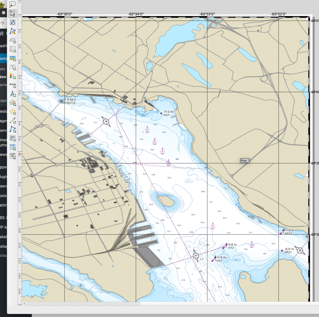
The inset Chart of the South end terminals is created much the same way – its simply a second map window sitting on the first.
from here we can add a couple of compass roses. these are svg images, with the inner getting rotated and set to the correct position.
then all that’s left is the title block, and any additional notes you want to add.
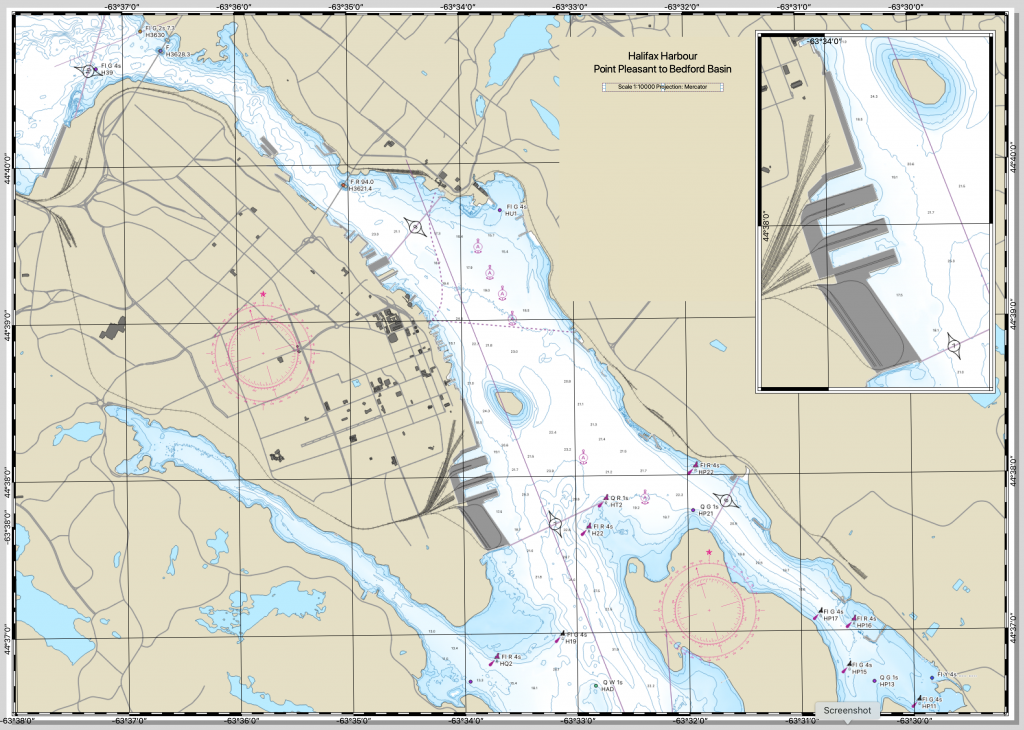
Please note that for the sake of time, not all details were rendered in the chart at this time (Some buoys are not symbolized, not all depths are present. title block is mostly blank, etc.)
Pingback: How to produce a Nautical Chart – GeoNe.ws
Pingback: Making the Burn Map | Halifax Shipping News.ca